Grid-Faced: How Sculpture Flats Got its Shape
/Ever wonder why a building looks the way it does, where the inspiration for the design came from, and how materials were chosen? It’s not always someone’s harebrain idea or fever-dream-inspired drawing. Actually, the majority of buildings you see are shaped by many, greater external forces. A lot of thought and strategy goes into problem solving size, form, function, and materiality within a limited budget. And there’s also the site’s location and geography: the landscape, climate, plot shape, and its relationship with the surrounding environment or community, not to mention zoning codes and ordinances. You get the point. To keep from getting too snoozy, we’ll stick to the project and budget because, in this case, those are the greatest forces driving this design.

Front Facade of Sculpture Flats. photo by Morgan Nowland photography
THE PROJECT
The large, flat, and mostly open rectangular site that used to be the home of Mr. T’s Interstate Tire was underutilized and ripe for a mid-size development, given the lack of housing options on the Southside. The property was divided in half by the existing 3500 sq. ft. building that served as Mr. T’s commercial space, and the developer, Jay Martin, whose company Renew has made a name for themselves bringing new life to historic buildings, chose to keep the 1962 solid brick structure as a commercial space and clean up all the under utilized real estate around it to create a flexible, live-work community.

Mr. T’s interstate tire before, surrounded by tires and woods
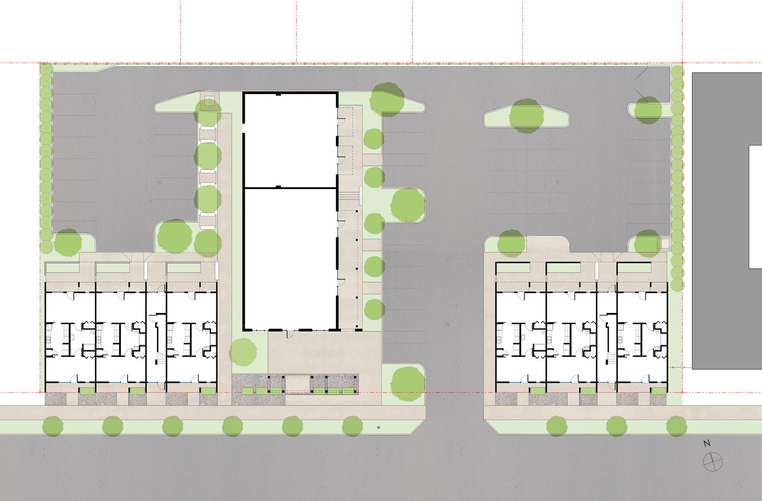
sculpture flats site plan. The former mr.t’s interstate tire is in the middle and is flanked by new residential spaces.
THE BUDGET
Two words: severely restricted. This project was Jay’s first foray into both new and multi-family development, and since real estate development is a risky and competitive industry, being fiscally cautious was responsible for the long-term sustainability of his business and for meeting market rate rents, as keeping costs down would ultimately result in reasonable rents for a middle-class market.

completed sculpture flats. Walking by, the prominent features are color and edges. photo by Morgan Nowland photography
THE DESIGN
As with any task on a limited budget, designing requires being resourceful and creative with what you have to work with - fewer options, fewer materials, less space, and less time, none of which are mutually exclusive. So changing materials means designs have to be redone, which - you guessed it - costs more time and money. In order to capitalize on our resources and prevent having to redo any designs, we strategized around the question: What single, big Architectural move can we make that will withstand any changes in materiality?
Thus, the grid-face was born. By giving the building a strong geometry, its most outstanding feature was unaffected by factors like the type, size, number and placement of openings. Since neither the windows themselves nor their arrangement were anything spectacular, the matrix of boxes produce a window-like visual. And for the residents, the frame creates the added amenity of a protective, private stoop or balcony. Since there isn’t much directly across the street to view the project head on, the facade was constructed to be experienced by passers-by. So rather than have the buildings mirror each other, there is a continual pattern that creates a rhythm. As pedestrians, cyclists, and motorists, we see the pops of color that reinforce the edges and pattern, even encounter a cadence as we pass, and we effectively overlook the materials themselves.
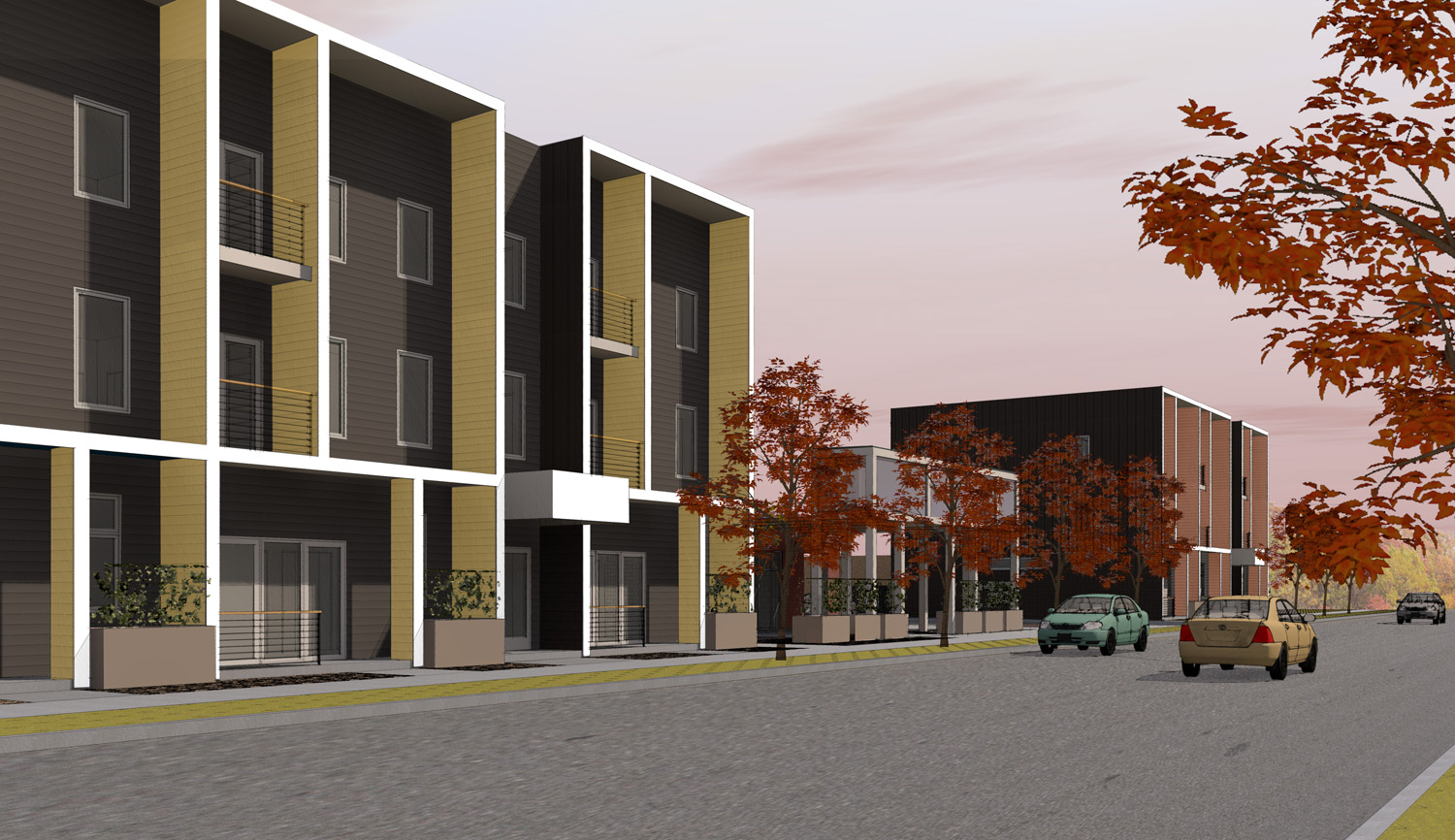
Original rendering for sculpture flats. note the envisioned colonnade in the middle.

completed sculpture flats. Note the gap in rhythm and density without the colonnade. Photo by Morgan Nowland photography.
THE END PRODUCT
Due to cost, many new construction projects you see in your day to day don’t reflect the original design. The process of eliminating materials, products, and even design features is called value engineering, or - if you’re in the know - “V.E." Because of our robust geometry approach, we were lucky that the only significant component that got “VE’ed” was the colonnade we envisioned between the two buildings, which served two purposes. It would have provided a buffer between the street and the patio of Handup Handle & Bar, and it would have created continuity from one building to the next, but it wasn’t financially viable, which we get. You can’t have everything, and designing some funky, colorful buildings were big wins in the first place!